Year
2011
10 entries in this year | view all years
Boraxologically Speaking
Posted December 2011 in Advertising, Publishing
Is logical. And I’ll tell you why. Because the Boraxologist told me so. How else to explain the 1906 publication of a small book featuring the work of American Photo-Secession founder members Clarence White and Gertrude Käsebier as a way to convince folks to open new savings accounts at a bank in Rochester, New York?
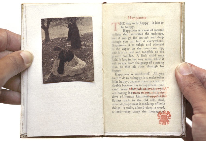 Happiness is finding the work of American Photo-Secession founder member Clarence Hudson White's work in the tiny book "Homespun Essays" published late in 1906. Shown here is White's photograph "The Orchard".
I’m guessing you have no clue what I’m talking about, but if you happened to be alive in 1904 and flipping through your daily newspaper, chances are good you might have encountered a drawing of a wise old mule-named the Boraxologist—lauding the untold benefits of “20-Mule Team Brand Borax”—a water-softening agent used in the laundry. Today, Borax® is best known as a laundry “booster” and multi-purpose household cleaner. But thanks to the sayings of this mule a century ago, you may have believed the Fountain of Youth and Holy Grail were cleverly disguised in a box—humbly biding time on the general store shelf, awaiting your purchase to give new life to dirty clothes.
The mind that came up with the mule with the funny sounding name and that little book from the bank was from a gentleman by the name of Otis H. Kean. A book publisher and advertising agent by profession, Kean turned creeds and in his own words, “optimistic aphorisms” into advertising copy by the barrel. “Such things seem to please the people” he said in 1904, regarding his “wisdom” dished out as part of the borax campaign. While reading through much of his published copy in preparation for this post, the modern figure of Don Draper did cross my mind, but of course from the “kinder and gentler” era of the early 20th century. I have no doubt if Kean was given a client’s account with the challenge of selling the benefits of more snow to a group of Eskimos, he would have no hesitation with the challenge. In carrying this mindset forward, Kean’s contact with cutting edge artistic photography by Clarence White and Gertrude Käsebier was simply the opportunity to consummate a marriage: photographs as visual aphorisms if you will. Why just confine their work to a gallery he may have thought, when it could be the perfect foil in promoting the virtues of opening a new savings account at the just opened Rochester Trust & Safe Deposit Company’s new building?
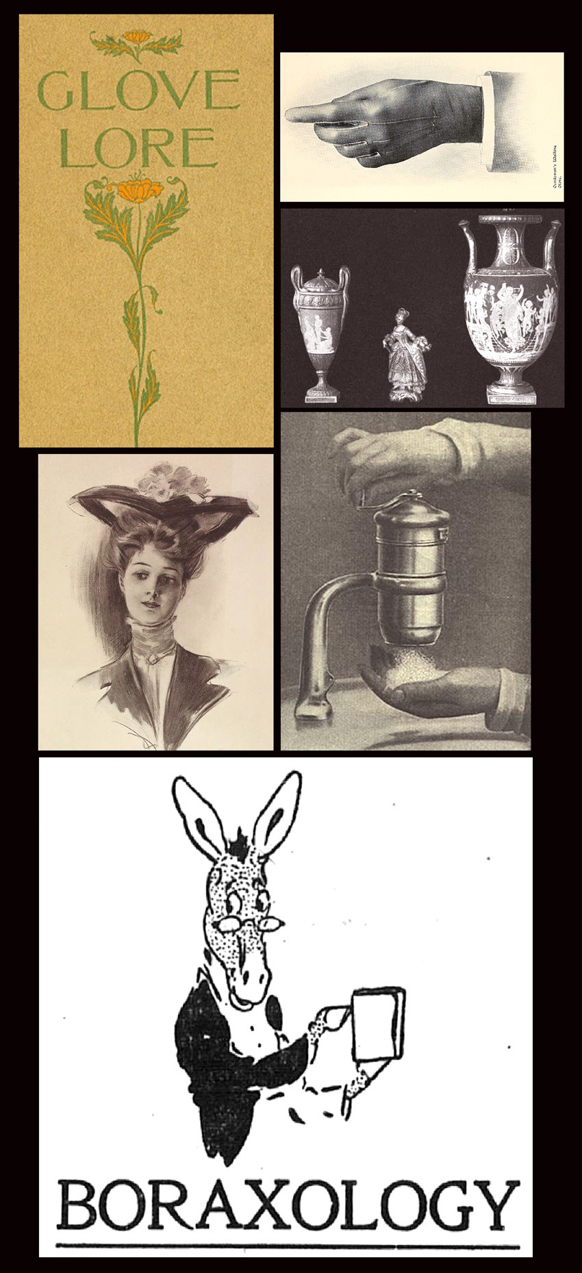 Examples of specialized publications and advertising work published and carried out by the firm of Otis H. Kean from 1897-1906: clockwise: brochure cover-"Glove Lore"-1897; gentleman's walking glove from Glove Lore; photograph of Dresden porcelain from book "The Art of Giving"-1902; advertising photograph showing Hygienic Soap Granulator in use from McClure's-1906; newspaper caricature advertisement of the "Boraxologist", a mule-1904; American Girl Picture No. 4 from Pacific Coast Borax Co. advertising campaign-1904.
Boraxologically speaking, how exactly did Mr. Kean persuade or convince this aforementioned gallery owner, none other than Alfred Stieglitz himself, that using White’s and Käsebier’s work was in his best interest? A moot point perhaps, because Kean succeeded in issuing this tiny book, titling it “Homespun Essays—Everyday Thoughts About Everyday Life”, which featured their work. Of course, their encounter may never have happened, but if it did, a conversation between this wisdom spouting advertising man and fierce guardian of the American Photo-Secession would have been amusing to say the least.
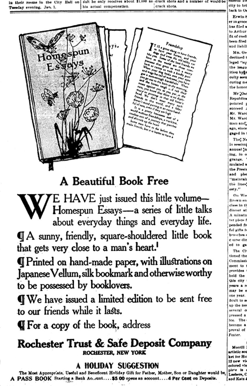 This advertisement for the free book "Homespun Essays", arranged and printed by Otis H. Kean, was placed and appeared in at least 15 newspapers in and around Rochester, New York in late December 1906 by the Rochester Trust & Safe Deposit Company. The ad was a promotion for people to open up new savings accounts at their new bank.
My own take on Kean while preparing Homespun Essays for this site is this: a perfectionist with a heart. The specialized books he published in conjunction with his business concern, the Literary Print Shop, were high-class productions and in this regard, his possible saving grace in relation to any possible dealings he may have had with Stieglitz. It wasn’t as if he was opposed to all commerce of course, but you do have to consider Stieglitz was most definitely an anomaly in the gallery world when and if Kean crossed his threshold in pursuit of “business”. This is because his well documented and self-prescribed “fight” for photography in America took the form of fierce protector and champion of White’s and Käsebier’s photography at a time when the very concept of hanging artistic photographs on gallery walls was in itself a revolutionary act. Kean’s involvement with fine printing and his possible business relationship with the Quadri-Color Printing Company in New York City—a firm responsible for the first true, four-color printing in America beginning in 1904, would have also given both a healthy respect for each other and a way to start a meaningful conversation.
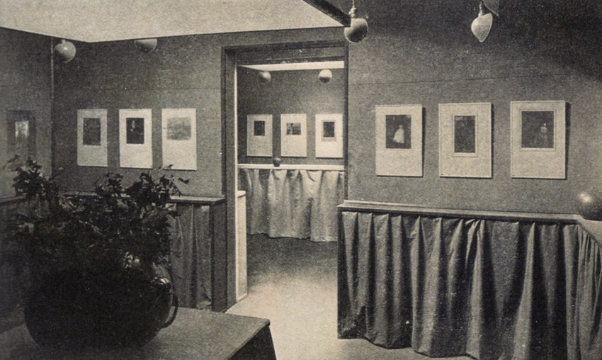 The work of Clarence Hudson White and Gertrude Käsebier was one of the very first shows of artistic photography Alfred Stieglitz showed at his Little Galleries of the Photo-Secession from February 5-19, 1906. Advertising agent Otis H. Kean may have seen this show, which would have given him reason to print examples of their work in "Homespun Essays" in December of 1906. Photograph from halftone plate reproduced in Camera Work XIV: 1906.
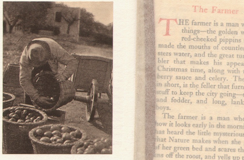 "Fruits of the Earth": (6.4 x 4.9 cm) by Gertrude Käsebier, a multiple-color halftone, is her sole photograph appearing in the book "Homespun Essays", accompanied by an essay written by Kean titled "The Farmer". Printed tissue guards, an example seen here, protect all book plates, and issued with red silk bookmark seen underneath guard. The photograph was previously reproduced as a photogravure by Stieglitz in "Camera Notes" from October, 1901.
Please visit our latest opus on Homespun Essays here, and prepare yourself to be “homespun” if you decide to read the posted essays along with the photographs, where you may smile and even laugh, especially after digesting this following tidbit from the book’s publisher: “The Trust Company never dies, never absconds and is immune from those possibilities of loss that may happen to every individual.” But then again, don’t cry too much when you find out they actually paid 4% interest back then on a savings account.
Cyber Sleuthing Aloha Style
Posted November 2011 in Significant Portfolios
I’ll admit to never having stepped foot on any Hawaiian island, but I did “drive” a few roads in Honolulu recently thanks to Google’s Street View feature, all for the sake of checking out the topography near Maunalua Park, its proximity to Fort Shafter; the island’s oldest military base nearby, and the more distant city of Honolulu itself, an approximate 11 minute trip according to its algorithmic brain trust.
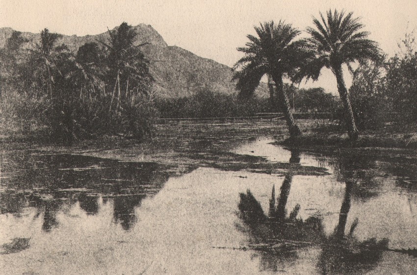 Detail: gum bichromate album photograph: "Palm Reflections at Kapiolani Park" : 15.4 x 20.5 cm
My reasoning for this is the newest addition to this site, an album of gorgeous gum bichromate photographs circa 1900-1910 I’m calling Hawaiian Landscape | Japanese Garden Album, possibly taken by a very gifted amateur photographer who called senior Army headquarters in Honolulu home. What made me pursue this research path? Since no attribution or even titles to the photographs exist in the album, I could only rely on the one clue left in it: a single photographic support stamped “Official Business” evidently used as a mailing envelope.
On the back of it is a return address for the United States War Department, based in Honolulu, further known as Headquarters Hawaiian Department. The other clue was the envelope’s addressed recipient. And this is where the trail gets really maddening, because it is mostly deliberately rubbed out. Just enough to fail any military censor but enough for me to figure out it was addressed to a Commanding Officer, also based in Honolulu. More online checking showed the term Hawaiian Department didn’t come into official use until early in 1913, which then presented another conundrum: the final mounted photograph in the album shows a nighttime view of San Francisco’s Market Street during the September, 1904 encampment of the Sovereign Grand Lodge of the United States and Canadian Independent Order of Odd Fellows.
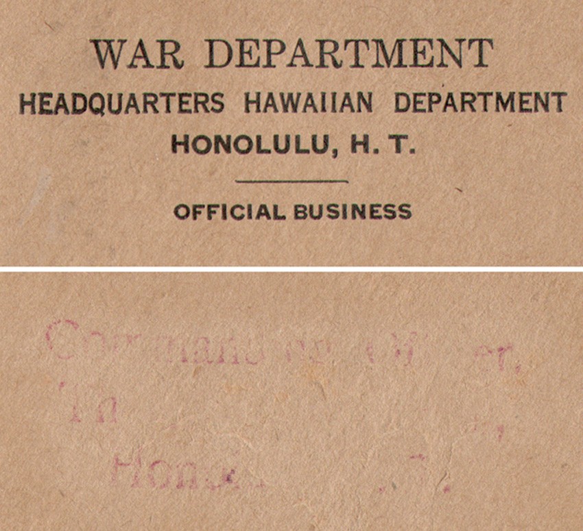 Top: detail of return address on support verso for album photograph "Diamond Head | Lēʻahi" | Bottom: detail of envelope recipient: "Commanding Officer…..?" The identity of this person may be the album's photographer.
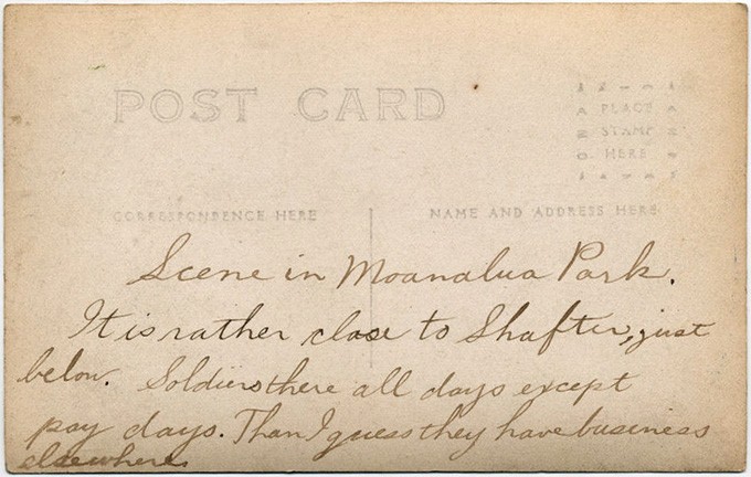 This divided back RPPC postcard from a private collection was stumbled upon online while doing research for the album. Apparantly, Moanalua Park was quite the destination for those in the U.S. Army and stationed at Fort Shafter. Period script: 1910-1915 states: "Scene in Moanalua Park. It is rather close to Shafter, just below. Soldiers there all days except pay days. Then I guess they have business elsewhere." The album's photographer also spent a good deal of time at the park.
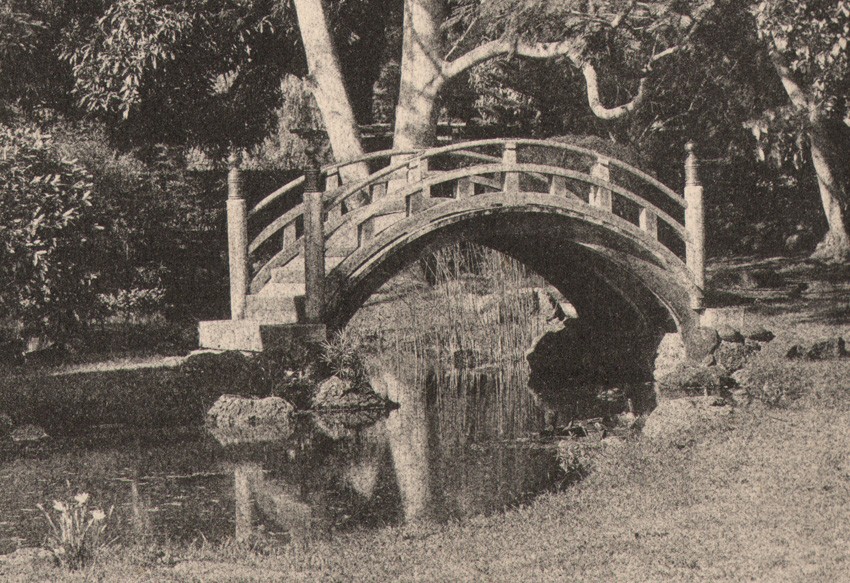 Detail: gum bichromate album photograph: "Japanese Tea Garden Bridge : Moanalua Park" : 15.2 x 19.4 cm
But photographic archeology can be my peccadillo sometimes. In revisiting “the envelope”, I of course could not leave well enough alone. I went ahead and searched for a Commanding Officer whose first name was Thomas, the name that seems to make sense to my feeble gray matter since the sole letters “Th” appear under the Commanding Officer recipient address stamped on it. The name of Major Thomas J. Smith, who headed the Hawaii Ordnance Depot for the U.S. Army in Honolulu in 1917 was a lone result that turned up, placing it farther away from the working 1900-1910 dates I’ve assigned this album based on the final 1904 image included in it. In that case, I or anyone else may never know who took these lovely- and in the case of surviving artistic photographs from the Hawaiian Islands at the turn of the 20th century- very uncommon and rare photographs.
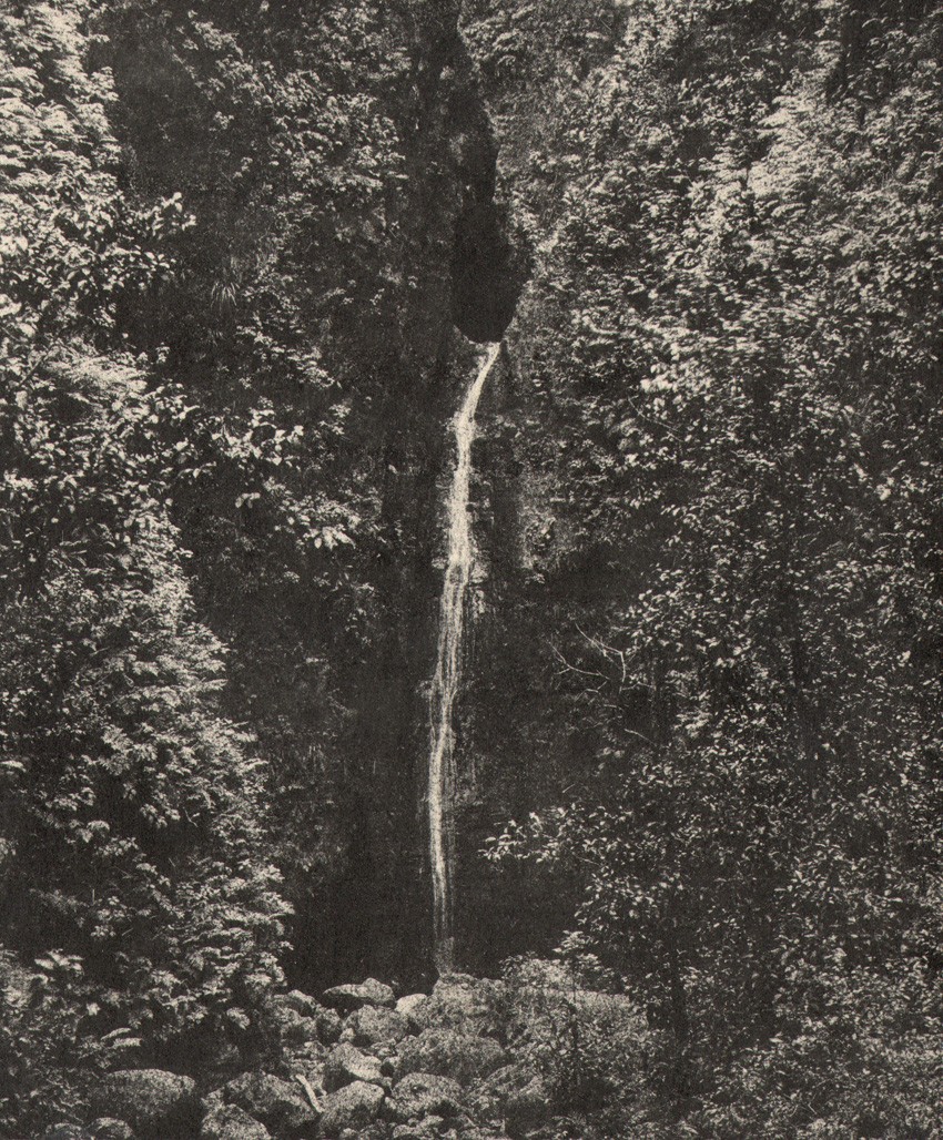 Detail: gum bichromate album photograph: " Sacred Falls : Oahu" : 19.0 x 15.6 cm
But the real-life photographer in me does want to give someone credit for them. Were the photographs assembled for the album after the person left military service, if they were ever enlisted in the first place? In that case, the photographer simply re-purposed an old piece of correspondence-addressed to himself or someone else- to throw everyone-and especially yours truly- off his or her trail.
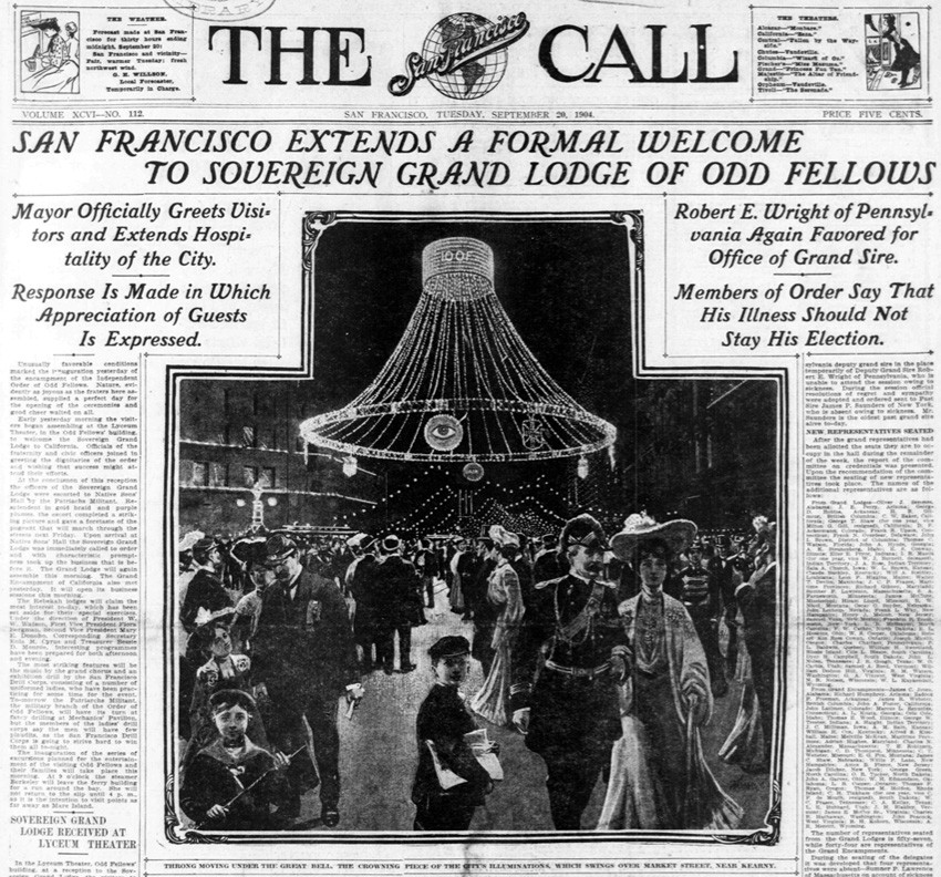 Detail: This front page artists rendition of an illuminated Market street at night shows one of the illuminated "bells" at center. The cutline used underneath states: “Throng Moving Under The Great Bell, The Crowning Piece of The City’s Illuminations, Which Swings Over Market Street, Near Kearny.” from: front page: San Francisco Call: Tuesday, September 20, 1904.
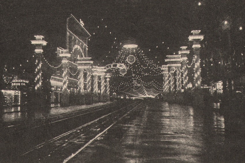 Detail: gum bichromate album photograph: "Independent Order of Odd Fellows Encampment Lights on San Francisco's Market Street" : 12.1 x 17.1 cm. This wonderful night view of the city was taken sometime during the week of September 19-24, 1904 and presented as the last photograph in the album.
So Aloha to your memory anyway, whomever you are. And thanks for this record of Hawaii from a place lost in time. If desired, please visit here to begin your Hawaiian vacation.
Italian Pilgrimage to the Past
Posted November 2011 in Significant Portfolios
2012 will mark a century since a lovely collection of photographs of Italy were taken and assembled into a personal, miniature Grand Tour type album recently added to our collection here at PhotoSeed. As photographs, I feel they stand on their own strong merits but alas, an elusive missing piece for posterity is a record of their maker. Stamped on the cover is the simple title of its’ contents: Jtalien 1912 (Italy 1912). After purchasing it from a gentleman in Holland several years ago, I quickly deduced the photos were of German origin.
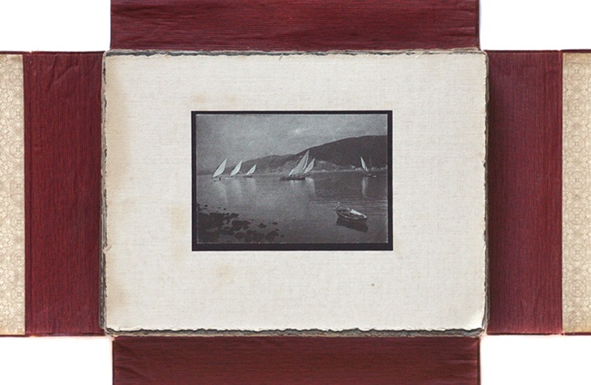 "Jtalien 1912" is the name embossed on the cover of this opened, four-flap album showing the mounted photograph "Sailboats on Lake" : image: 7.3 x 10.7 cm : mount: 15.5 x 21.3 cm atop others contained within it.
In this regard, language was the clue. Other German material in our archive contains this early spelling for Italy in the German language as well as Italian using the capitol letter “J” instead of an I: Jtalien and Jtalienische. But what sealed the deal for me was the curious addition to the album in the form of a later mounted snapshot of a group of 12 men wearing military clothing. A small sign propped up in front of them states “1914 Feldzug 1915”.
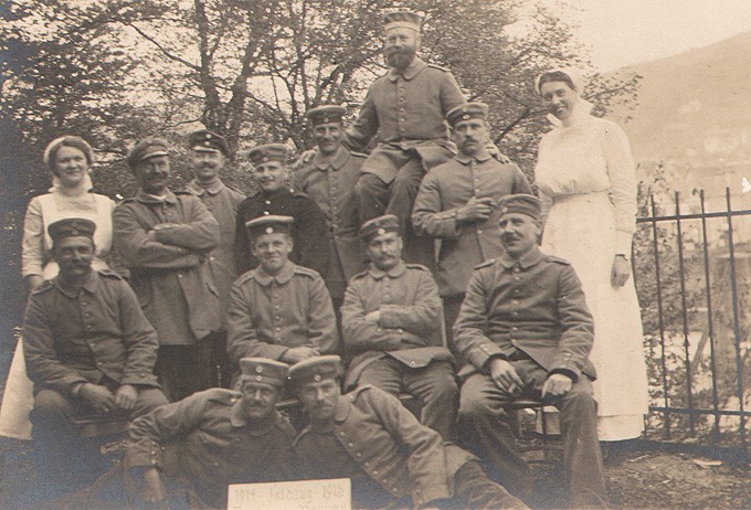 Detail: "1914 Feldzug 1915 : German World War I Soldiers" : (7.8 x 10.4 cm) this portrait of World War I, German Imperial Army soldiers may be a clue to who is responsible for taking the photographs making up the 1912 album.
From this photograph I determined they are wearing World War I issue, Imperial German Army uniforms. “Feldzug” further translates to “Campaign” in German. I’m no military expert, but these guys don’t exactly look like they have just returned from the front lines. Instead, they are smiling, one holds a cigar, and another bearded soldier propped up in the back row poses for the camera while placing his hands on the shoulders of his comrades. Two women flank the group and appear to be nurses of some kind. A military hospital setting? Or perhaps soldiers on an extended R&R assignment? Is the same elusive photographer responsible for the marvelous images in this album sitting among them? And why not the possibilty one of the nurses could actually be our photographer? How did this album end up in the Netherlands, which remained neutral during The Great War? For these questions I have no answers at the moment, just more questions.
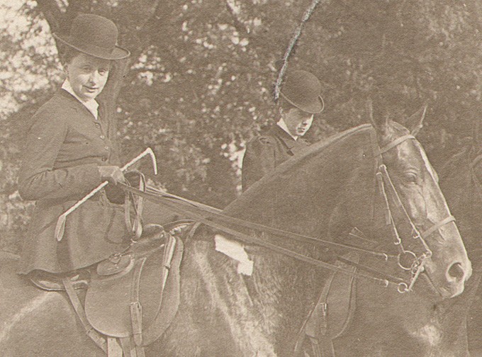 Detail: "Women on Horseback": (7.5 x 10.4 cm) Another clue to the origins of the album?
Another potential clue to the album’s familial origin is the inclusion of a photograph of two women sitting side-saddle on horses. They may only be part of a larger party connected with the album’s fox hunt gathering photographs or merely a separate moment of repose while they take a pleasure ride in another location.
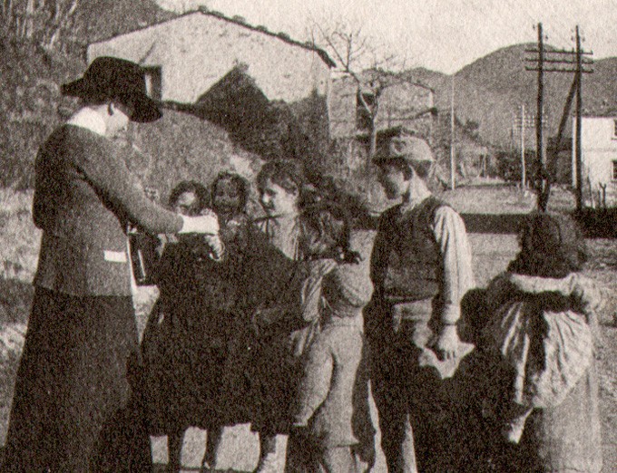 Detail: from album photograph titled: "Woman Greets Italian Village Children". (9.6 x 8.0 cm) The woman on left appears to be presenting this group of Italian village children with a bottle (wine?) and clutch of flowers.
My own hunch is the woman looking directly into the camera on horseback is the same woman shown in a separate album photograph. In it, she presents several gifts-a bottle of wine (?) and clutch of flowers to a group of Italian village children, several barefoot. But again, deductions, not facts.
 Detail: from album photograph titled: "Village Children Gathered for Portrait". (9.8 x 7.9 cm) The same children pose for a photograph against a stone wall. Compositionally, this image is different than others in the album and is printed on gelatin silver paper, instead of a pigment process used for the majority of the photographs.
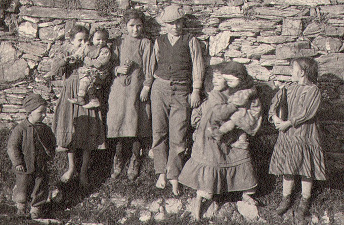
What I can say conclusively about the album’s 60 or so mounted photographs is they are a visual delight and important record of Italy before the outbreak of World War I. Some of the images are strikingly beautiful: the Italian countryside in particular but also of subject matter one rarely sees in “typical” Grand Tour type albums (not the commercial or snapshot variety) : carefully framed and presented images of dirt roads, life in a back alley, a woman in bonnet caught unawares while most likely harvesting mussels at the seashore, a mysterious detail of a gate affixed with several crosses as well as many of the country’s famous landmarks and important Roman Catholic churches.
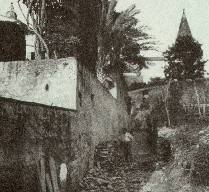 Detail: album photograph: "Man Working in Alleyway" : 10.9 x 8.5 cm
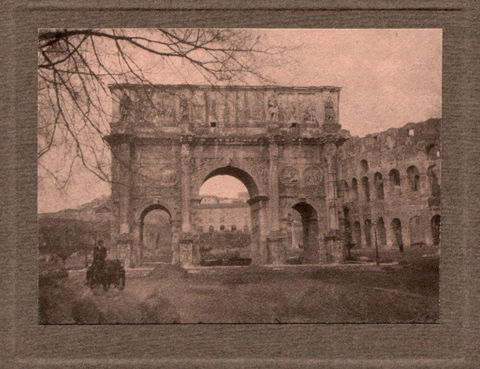 Album photograph: Arch of Constantine: 7.9 x 10.8 cm
These photographs are not topographical records but instead are done with a pronounced pictorialist aesthetic. Printed in multiple colors (ozobrome-a transfer pigment process-may be a hunch for some) and mounted on colored supports-they are individual jewels waiting for your own critical eye. Please follow this link to make your own Italian pilgrimage to the past.
Voici la Blog! | Here is the Blog!
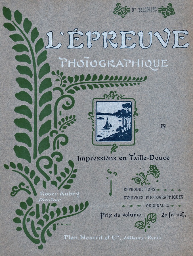
Posted September 2011 in Significant Portfolios, Typography
The process of preparing material for this website has been a real education for me. In picking apart and studying the components making up the two latest French portfolios added: L’Épreuve Photographique (The Photographic Print) for 1904 and 1905, knowledge has come in both large waves and tiny revelations. One of these waves has been some of the poetic, profound, and often humorous writing of French art historian and critic Émile Dacier.
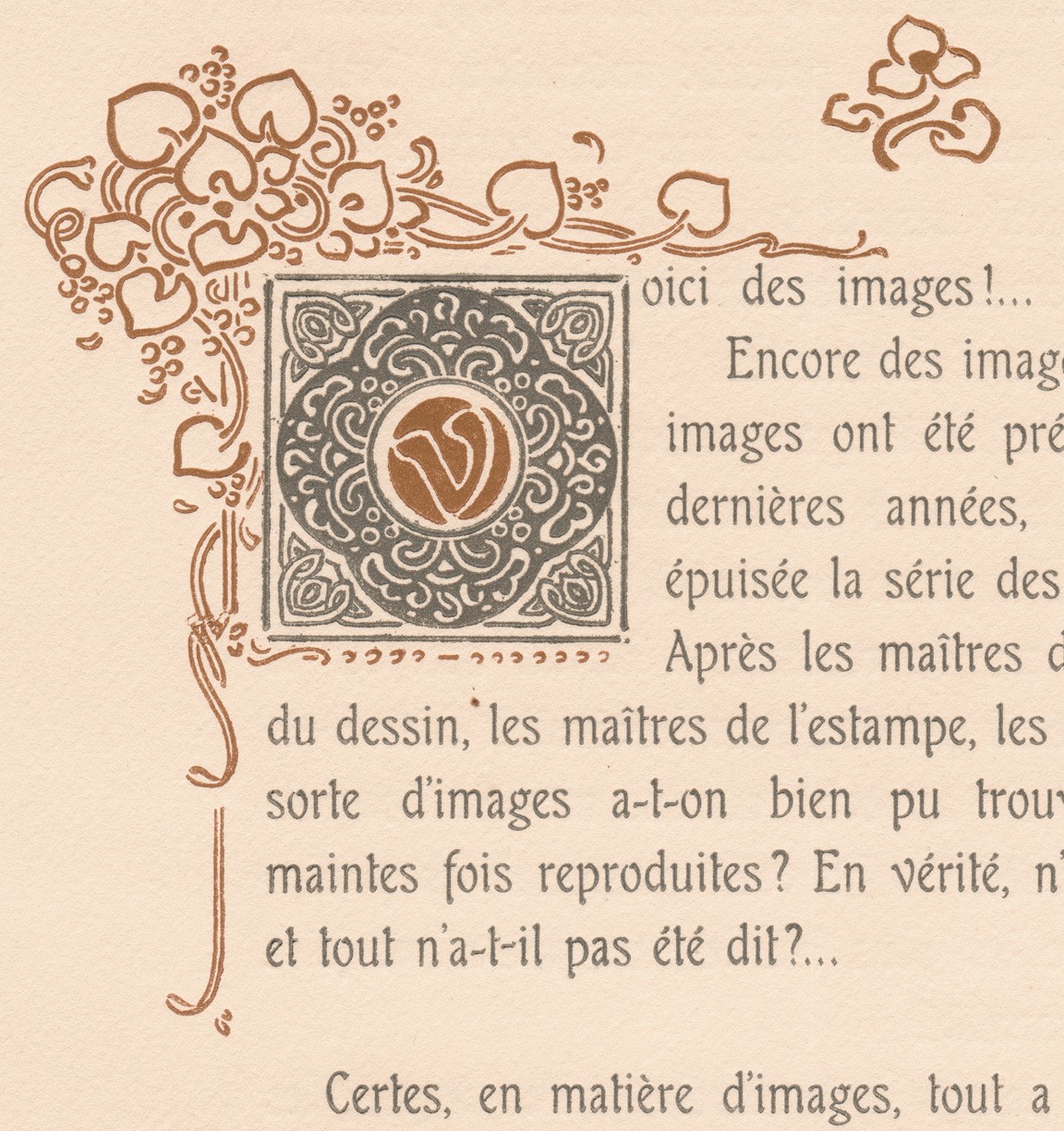 This stunning woodcut initial, designed by the French artist and type designer George Auriol , (1863-1938) begins the preface to the 1904 First Series portfolio of L’Épreuve Photographique, written by Émile Dacier, 1876-1952.
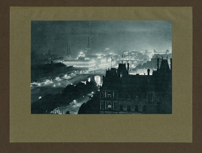 Photographer J. Petitot found a high vantage point to photograph Paris, The City of Light, for the Second Series, 1905 portfolio of L’Épreuve Photographique. Petitot was a member of Société D’Excursions des Amateurs de Photographie in this magnificent city.
Here is an example of him speaking of his perceptions on the artistic photographic plates-included in his preface to the 1904 portfolio:
“These are the memories of distant lands, these are the tragedies and comedies of the street where chance is the great director, and here the pressure of crowds, the galloping squadrons, the shock waves on the breakers…”
And earlier, his delightful account of Photography and photographers in the dark ages-before their creative impulse was set free:
“Photographers! These terrifying figures to children that their souls have kept long stubborn grudges! …To visit these murderers as children we had to dress up-like the condemned. After the mandatory cutting of the hair, torture ensued by the shaking of the neck yoke…”
 The First Series (1904) cover to L’Épreuve Photographique. Type designer George Auriol designed the floral vignettes and other typographic elements that were integrated into the cover as well as for the half-title, title, preface pages (1904 only), plate tissue-guards, and separate “Table” index page (listing titles of photographs to corresponding photographer) found in the collected yearly portfolios for 1904 and 1905.
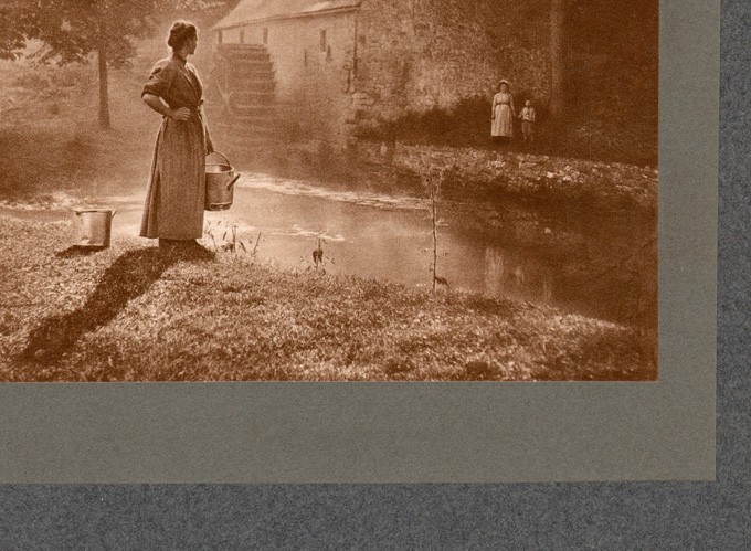 Photographic plates, like this detail by Belgian photographer Léonard Misonne, are reproduced for the portfolios from original source prints as hand-pulled, Taille-Douce (copper plate) screen photogravures. They are often double mounted, as shown, to a larger colored support measuring 44 x 32 cm and covered with a tissue-guard.
Tiny revelations: the editor of L’Épreuve Photographique, Roger Aubry, was not only a photographer and inventor, but a passionate balloonist who survived a crash into the Grand Palais in 1905 while taking photographs above Paris. And another: the very typeface that survives in some of the signage used in the Paris Métro train stations- Auriol, was designed by namesake George Auriol, a French artist, type and graphic designer who used his new typeface as well as other Art Nouveau elements in his commission of L’Épreuve Photographique by the Paris publisher Librairie Plon.
 The Annuaire Général et International de la Photographie. (General and International Directory of Photography) published this advertisement for the Second Series, 1905 portfolio of L’Épreuve Photographique .
 This burin-enhanced portrait, "Etude", by French photographer Robert Demachy, was used as the frontis plate to the 1905 Annuaire Général-reproduced as a hand-pulled photogravure by the Rembrandt Intaglio Printing Company of London. Dimensions to work: 13.8 x 12.0 cm.
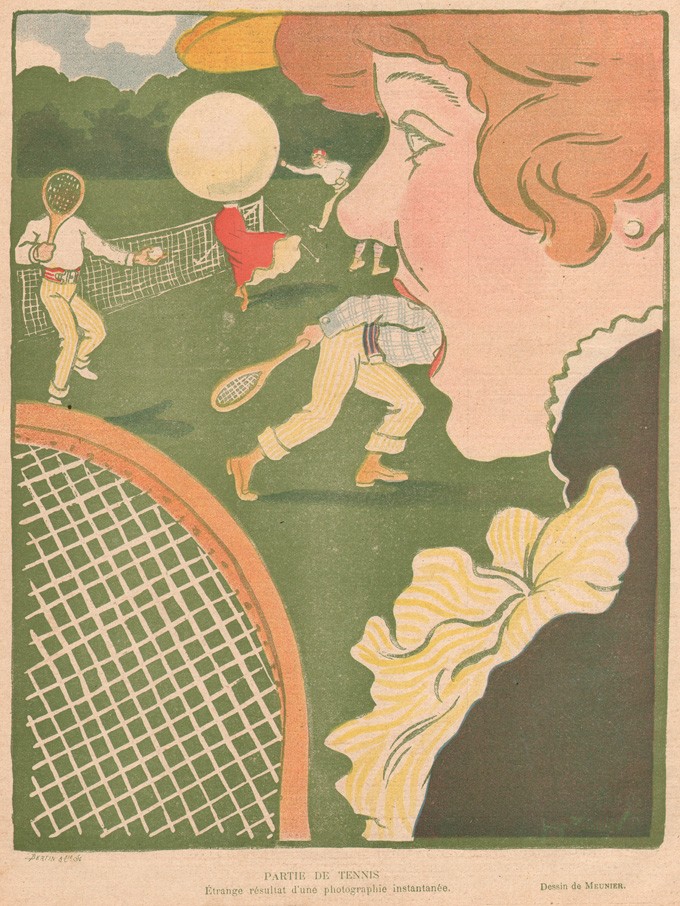 The humorous and sly observations of French writer and critic Émile Dacier, who wrote the preface to L’Épreuve Photographique in 1904, also extended to a much larger, illustrated history of perceived photographic mishaps, included in the 1905 edition of the Annuaire Général and titled "La Photographie à Travers L'Image". (Photography Through the Image) This drawing titled "Partie de Tennis: Étrange résultat d'une photographie instantanée" (Game of Tennis: Strange result of a snapshot) by the artist Meunier was included. (this example from source-Le Rire: June 22, 1901)
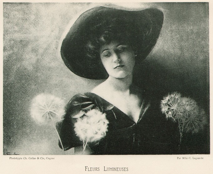 Auriol's relationship with the Annuaire Général is subtle, considering he was largely responsible for the design of L’Épreuve Photographique. The annual uses the Auriol typeface for the working titles of select plates, including this example: "Fleurs Lumineuses", taken by French woman photographer Mlle. Céline Laguarde and published as a collotype plate by Ch. Collas & Cie of Cognac (Charente). (dimensions: 10.8 x 14.7 cm)
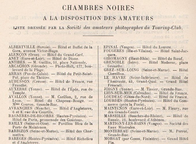 I'm not here to check in, I just want to use your Chambres Noires……and for the traveling photographer roaming France in 1905, a subscription to the Annuaire Général would even include this list (detail shown) of available darkrooms at the disposal of amateurs compiled by the Société des amateurs photographes du Touring-Club.
 George Auriol- designed floral vignettes like this one grace several of the letterpress pages of L’Épreuve Photographique, adding elegance to this sumptious portfolio work.
In 1903, Aubry had taken over the editorship of the Librairie Plon’s Annuaire Général et International de la Photographie. (General and International Directory of Photography) Published in Paris, this was an annual encompassing a little bit of everything photographic, but with a more scientific focus in keeping with the tradition of the publication. I was fortunate to have bought a copy of the 1905 edition many years ago, and used it as a reference work when preparing these galleries. “Directeur”, another way of saying “Editor”, is the title assigned Aubry for this publication as well as for L’Épreuve Photographique. My respect for his work in compiling these portfolios keeps in step with the tradition of the enlightened city of Paris, their place of publication. We have additionally prepared a PhotoSeed Highlight for this work here, with a further link to all 96 plates making up the portfolios.
French Revolution Evolution
Posted September 2011 in Engraving, Journals
In France, prior to taking on the complex task of publishing the journal L’Art Photographique, (The Photographic Art) first appearing in July, 1899, Georges Carré and C. Naud in Paris had made a reputation for publishing volumes dealing in scientific, medical, as well as photographic subjects. Their journal the Photo-Gazette under the editorship of Georges Mareschal was the best known.
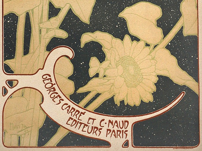 Paris publishers Georges Carré and C. Naud intended to showcase photography on the cover of L'Art Photographique but settled for the tried and true in the form of artwork and typography done by Czech Art Nouveau painter Alphonse Mucha instead.
With the committed goal of keeping the relevance of photographic art before the public eye and with the backing of France’s elite photographic body in the form of The Photo Club de Paris, Carré and Naud under the leadership of Mareschal set about contracting with multiple printing ateliers throughout the country (1.) in order to showcase work produced by the club’s members.
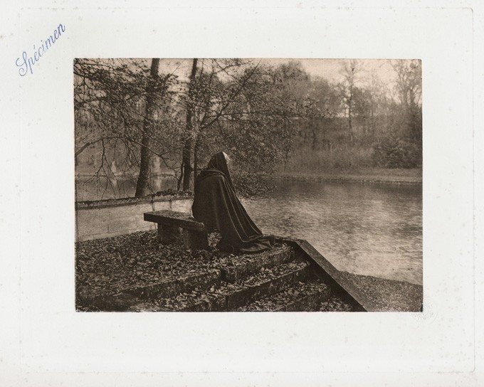 Carrying the imprint of Spécimen stamped in blue ink, this plate with the title "Automne" by French photographer Robert Demachy was eventually included with the October, 1899 issue of the journal. Without knowing any specific details, it may have been used as a working production publisher's plate at the outset to publication or even one to solicit potential subscribers for it.
Certainly with Franz Goerke’s Die Kunst in der Photographie journal in Germany serving as a model beginning only two years earlier in 1897, the publishers believed bigger was better, (46.0 x 34.0 cm) and the task of presenting French work (2.) as reproduction plates in the original size the photographer intended was the stated goal from the outset. Everything about this photographic magazine is admirable, and for France, this evolution would break new ground as the first monthly photographic publication solely devoted to the image itself. Looking back, it is also an important historical record of the cutting-edge, French photographic engraving being produced at this time. The photographic plates included with it are printed in the finest hand-pulled photogravure, collotype, (photocollographie) and single and multiple-color halftone. (similigravure) These in turn are printed, often by a separate atelier, on a variety of French papers running the gamut from hand-made plate paper to traditional examples of thick coated stock. To satisfy the photographic purist, technical details for the images are often supplied on the accompanying plate tissue-guards. So in a word, revolutionary.
 This Art Nouveau, publishers imprint ( 6.5 x 4.7 cm ) woodcut for Georges Carré and C. Naud by the French artist P. Ruty appears on the title page to the bound, collected volume of L'Art Photographique in our archive.
In the mission statement laid out by editor Georges Mareschal in the first issue, he explains the admirable intention of employing the cover itself to showcase a photograph. But because of logistical problems not revealed, (3.) the talents of Czech Art Nouveau painter Alphonse Mucha were employed in 1899 to design its cover used consistently over the one year run ending in June, 1900.
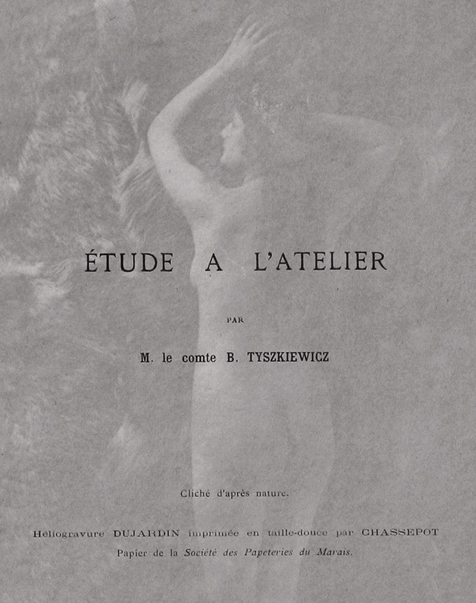 This detail of a tissue-guard for the plate "Étude a L'Atelier" by Polish photographer Count Aleksander von Tyszkiewicz, (working in Paris) is an example of engraving and technical specifics for work included in the journal. It was included in the September, 1899 issue.
At PhotoSeed, we are excited to be able to present all 48 photographs from L’Art Photographique in their order of publication beginning here.
Notes:
1. Nine in France and the long established firm of Jean Malveaux in Brussels.
2. Although several examples from Argentina, Belgium, England and a Polish photographer working in Paris are included.
3. My own conjecture on this surmises the publishers felt an over-sized magazine needed to be “shown off” better-especially with the resources being devoted to its production, and there was certainly no better way to do this than to employ a cover “poster effect” in the form of a full-color lithograph by Mucha.
New Fruit in Color, Black & White, and Shades in Between
Posted August 2011 in Color Photography, Journals, New Additions, PhotoSeed
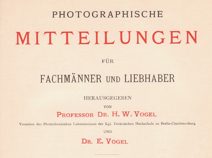
Since PhotoSeed launched a month ago, I have been putting together material on a run of the important German photographic journal known as Photographische Mitteilungen. (Photographic Reports) Several hundred photographs, almost all of them hand-pulled photogravures, are now searchable in our archive database. As a working photographer myself, it is an honor to be able to give new light to this material and introduce fresh eyes to it over a century later.
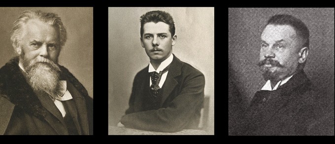 From left to right: Photographische Mitteilungen founder and editor H.W. Vogel: 1864-1898; his son Dr. Ernst Vogel, who edited the journal from at least 1893-1901; and Paul Hanneke-sole editor from 1901-1911.
The challenge for me has been trying to get things right the first time. The language barrier in assessing this material has often been difficult in some cases to overcome. But fear not. If I’m not comfortable about something regarding a translation, I will probably not include it unless I spell it out verbatim on the site-which I have done in a few cases already. I wish I could say I spoke five languages but since four years of high school French is my reality, Google as well as other online translation software has taken up the slack in this department. I have been translating titles of the work where appropriate (found in the misc. tags area) in order to give our English-speaking audience an idea what the photographer’s intent was as well. “Unidentified” seems to be my new favorite word on some days but consistency will always be my mantra while adding material to the site.
 This detail shows the title page for the 30th year of Photographische Mitteilungen covering 1893-1894.
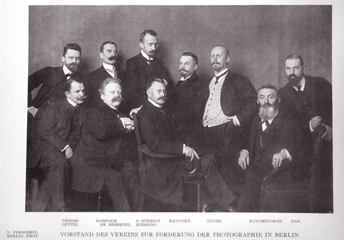 This photograph taken by Berlin photographer Nicola Percheid from the March, 1909 issue of Photographische Mitteilungen shows board members of the Association for the Promotion of Photography in Berlin. (Vorstand des Vereins zur Förderung der Photographie in Berlin) This is the same organization founded by H.W. Vogel in 1863. In the early years of the publication, the name was incorporated into the title page since the journal was actually its mouthpiece. (example- Photographische Mittheilungen: Zeitschrift des Vereins zur Förderung der Photographie) Over the years, the journal lost the "h" in Mittheilungen as well. Seen in this photograph at center is journal editor Paul Hanneke and to his right, journal publisher Gustav Schmidt.
In researching the history of the journal, I discovered early examples of color plates reproduced from 1893. Twenty years earlier, journal founder and photochemist H.W. Vogel had first figured out how color sensitizing agents could be added to photographic plates in order for objects to delineate themselves into their proper shades of gray.
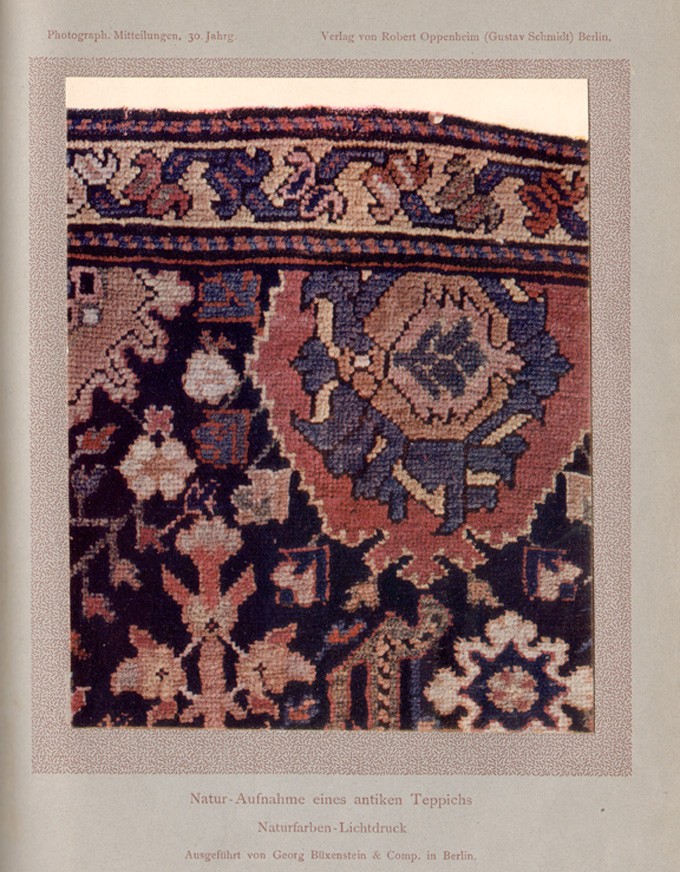 This very early natural-color collotype photograph showing a swatch of an antique rug was done by the atelier Georg Büxenstein in Berlin and reproduced as a full-page plate in the April 15 (heft 2) 1893 issue of Photographische Mitteilungen. Dimensions- image- 15.3 x 12.2 cm -support- 24.4 x 16.9 cm (trimmed)
Later, his son Ernst Vogel- (who had joined his father as co-editor at an undetermined date but at least since 1893) took up the challenge of printing three-color photographs in halftone as well as collotype. He first teamed up with William Kurtz in New York in 1892 (who was a good friend of his father’s) and a year later with Berlin engraver Georg Büxenstein.
The three-color halftone below showing a still life of fruit reproduced in the January, 1893 issue of the journal is believed to be one of the very first three-color halftones ever done on a large scale. In Berlin, Ernst Vogel’s subsequent business relationship with Büxenstein bore additional fruit in the form of this firm’s exquisite gravure plates now available for your examination on our site.
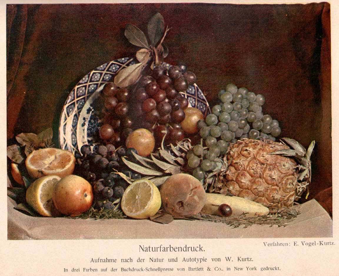 The New York engravers Bartlett & Co. under the direction of William Kurtz and Ernst Vogel printed this very early three-color halftone image. Dimensions: image: 13.3 x 18.3 cm : support: 16.7 x 24.5 cm coated stock paper (trimmed)
Launch Party Haiku
Posted July 2011 in PhotoSeed
I tend to get obsessed with detail oriented things and the lead-up to our official PhotoSeed launch party on Saturday, July 16th, 2011 was no exception. First off were the invitations. With my goal of making each invite a kind of keepsake for recipients attending or not attending the party, I first tried running thick-stock watercolor paper through an ink-jet printer and got results which were not consistent, with roller lines from the printer making more of an impression than Jay David’s outstanding PhotoSeed logo and custom typography did, and with the printer rejecting the thick paper stock on the second run through.
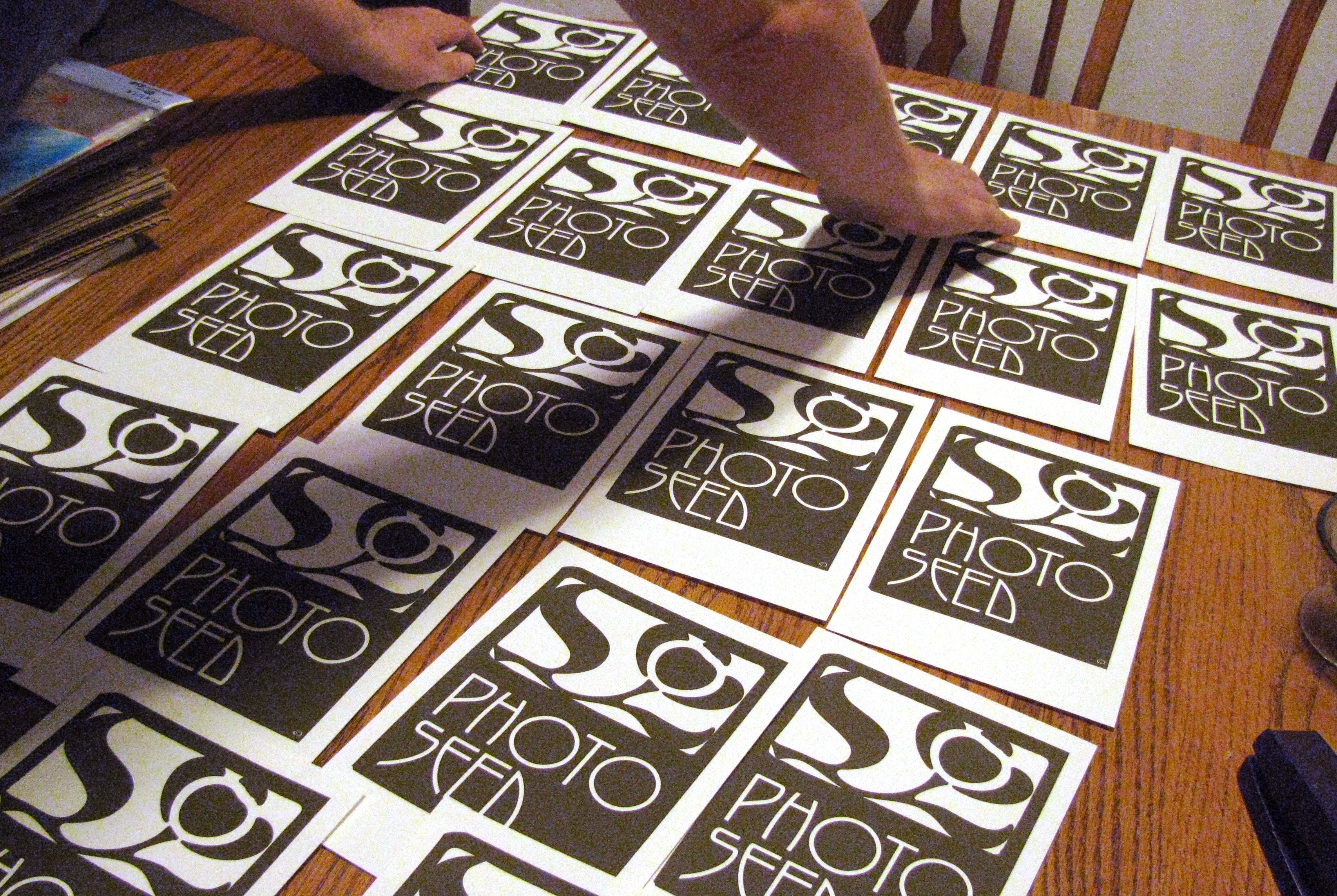 Just wanted to spead them all out one last time before entrusting their journey to Uncle Sam.
Plan B entailed going to a well-known and fully capable print shop in our fair city. They were gracious and ran a comp on a high-end color laser copier but the color wasn’t even close, with the ink resembling an elastic skin on the paper surface.
With my mind made up that the look of the invitations had to resemble a fine print, I revisited the idea of watercolor paper as Plan C, which involved part of a Saturday in St. Louis yakking to a very patient salesperson at a large art-supply store. I settled on some large sheets of French Arches watercolor-very thin- that would not pose a problem with the inkjet printer. I commenced in trimming them down to size in the store and later feeding them one by one into the printer, twice, in order to print the verso party particulars. Success at last. My wife Shannon came up with the groovy idea of incorporating a Haiku into the invite as well:
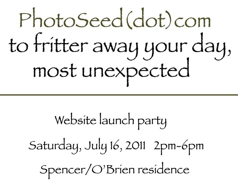 Fritter away!
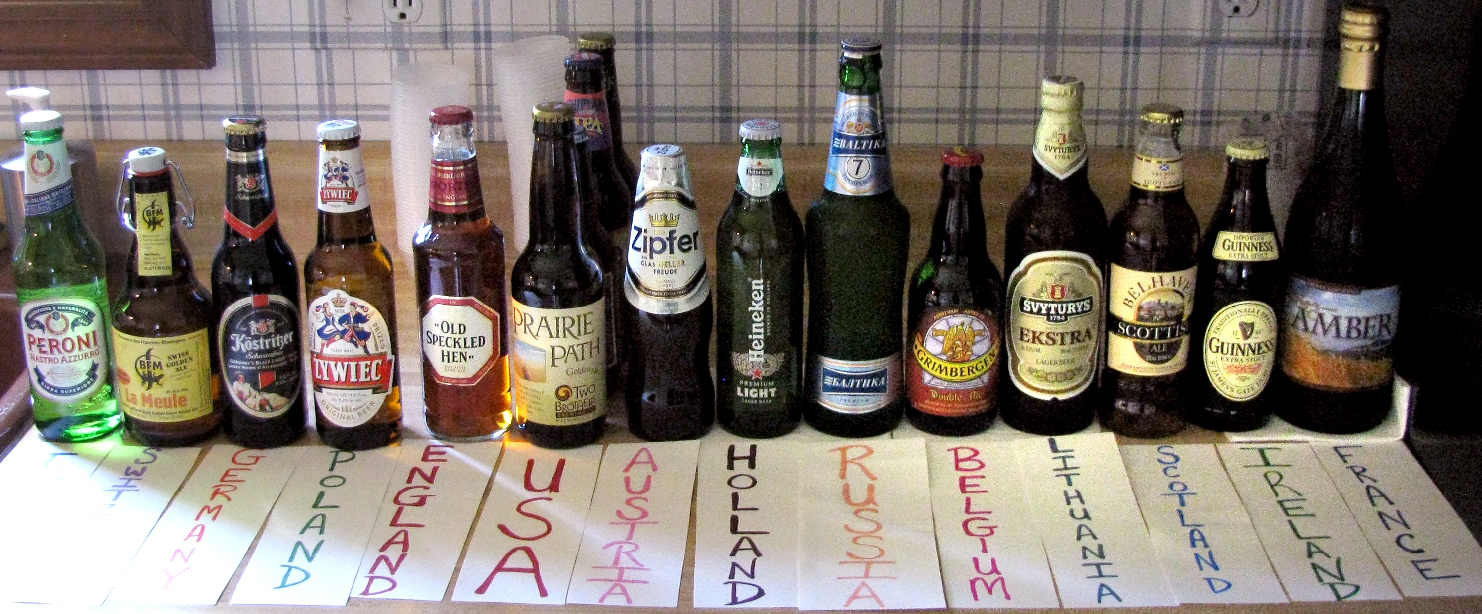 Still have not opened Russia and a few other countries, but I'm looking forward to it.
On launch day, beer, procured from 14 of the 17 countries currently represented in the PhotoSeed archive, was on hand for party tasting. An unexpected gesture from site developer Tyler Craft, who could not attend, seemed appropriate. A bottle of wine which he had ordered on the internet arrived in the morning and I used it later to raise a glass with thanks to everyone who has made PhotoSeed a reality. Thank You!
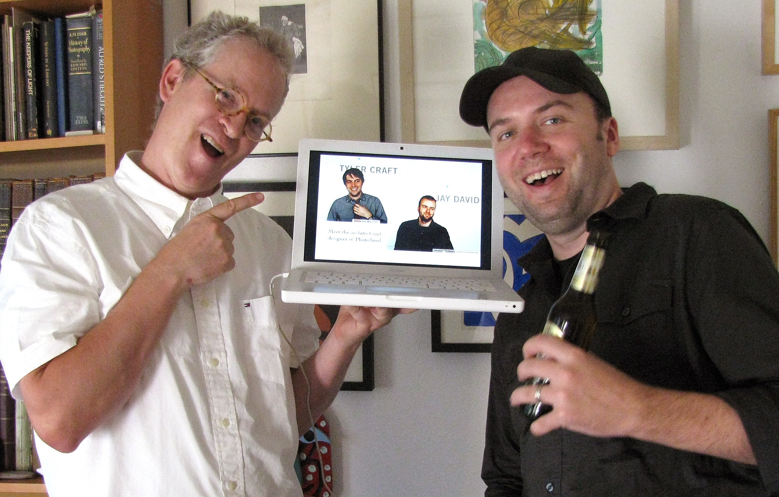 In the aftermath to the virtual ribbon cutting, Spence, left, and PhotoSeed designer Jay David pay homage to a cyber-shrine of site developer Tyler Craft, (and himself-thank you very much) during the party.
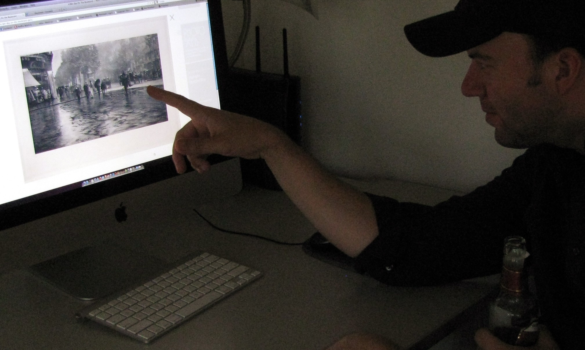 Jay checks out one of the large plate Stieglitz gravures on the site (Wet Day on the Boulevard-Paris, 1894) using the lightbox mode.
Prepare to be Mesmerized
Posted July 2011 in Texts
Welcome to PhotoSeed! When I was a child, my reading of English archeologist Howard Carter’s discovery of King Tut’s tomb in Egypt inspired me enough to start digging around in my own backyard. Later, as a young aspiring photographer, I came across a quote by American photographer Harry Callahan which really stuck with me: “I love art because it doesn’t have rules like baseball. The only rule is to be good. That’s the toughest thing to do.”
 PhotoSeed: A Compendium Designed for your Inspiration
Along with my parents, who instilled a love of art in me at an early age, the progression of my professional life as a newspaper photojournalist combined with an innate love for art and history has lead me to the present undertaking.
What is PhotoSeed? It is a destination based on derivation. It will evolve as an online photographic compendium focusing on the historical record of “artistic photography” roughly produced from the 1880’s to about World War I. With apologies to Alfred Stieglitz and others, there will be plenty of flim-flam, and the major “isms” of this era: aestheticism, naturalism, and pictorialism, will be here in abundance.
I’m not going to consciously ignore something because I don’t care for it. Mundane and repetitive work of the period is very instructive for the time in which it was created. Taken collectively, all of the work on this site added to the general conversation of ideas that pushed photography forward. I promise to make plenty of exceptions to keep things interesting, however.
The material presented here will continue to validate my own respect for Callahan’s observation “to be good” in guiding the site’s purpose, relevance and spirit. Carter’s influence will be illuminated by the site’s ongoing “photographic archeology” which will unearth delights not known by casual photographic historians.
That’s why I’m taking the time to share with you the fruit and results of photography’s early artistic efforts. In my estimation, their gleanings still matter. These photographs can and should inspire today’s practitioners—be they armed with ubiquitous cameras built into smart phones or those keeping alive the medium’s noble processes including daguerreotype, wet plate, and film.
As for its name, PhotoSeed’s derivation stands for growth and renewal in the photographic arts at a time when taking chances with a camera was seen by many as subversive. It is my hope PhotoSeed will evoke and conjure the time and place of when this photographic record was created.
For once planted, seeds, as represented by the ideas sown by photography’s pioneers and toilers alike, required only the sun overhead to realize their potential:
“Like the sunflower, the sun was a popular symbol with art photography clubs. It represented photography’s necessary light as well as the inspiration, power and renewal associated with otherworldly presence.” 1.
And about that “mesmerization” thing? The history of photography includes a delightful account of photographic hypnotism decades before George Eastman’s Kodak mania took hold and put people around the world in a different kind of trance.
English journalist Henry Mayhew, whose series of profile vignettes first published in 1851 as London Labour and the London Poor, included one dispatch published in the third volume of the series (1861). In his “A Photographic Man” (2), Mayhew writes about a former banjo busker turned photographer who teams up with another like-minded chap and enters the exploding yet dubious shilling and sixpenny portrait (ambrotypes & ferrotypes) trade. Sometimes, the duo are able to make a little bit extra at the conclusion of a portrait session. In this respect, the mysterious and telegenic power of the camera recounted in Mayhew’s profile reveals the gullibility (and empties the pockets) of the largely working poor clientele these photographic “entrepreneurs” cater too:
“People seem to think the camera will do anything. We actually persuade them that it will mesmerise them. After their portrait is taken, we ask them, if they would like to be mesmerised by the camera, and the charge is only 2d. (2 pennies) We then focus the camera, and tell them to look firm at the tube; and they stop there for two or three minutes staring, till their eyes begin to water, and then they complain of a dizziness in the head, and give it up, saying they “can’t stand it”. I always tell them the operation was beginning, and they were just going off, only they didn’t stay long enough. They always remark, “Well, it certainly is a wonderful machine, and a most curious invention.”
Here at PhotoSeed, mesmerization is absolutely free. So sit back, relax, and try not to get too dizzy. This operation is just beginning. We hope you do stay long enough to agree the artistic results of this most curious invention are most wonderful indeed.
—David Spencer (2010)
1. Janet E. Buerger, The Last Decade: The Emergence of Art Photography in the 1890’s (Rochester: International Museum of Photography at George Eastman House, 1984) 4.
2. Henry Mayhew, “A Photographic Man,” London Characters & Crooks: ed. Christopher Hibbert, (London: The Folio Society, 1996) 12: 295-303.
A Wedding gift to treasure: Julia Margaret Cameron's portrait of John Herschel
Posted June 2011 in Significant Photographs, Texts
Sir John Frederick William Herschel is someone to pay attention to when thinking about photography. And for no other reason? He is credited with coining the very word “photography” in the English language. (with apologies to French-Brazilian painter and inventor Hércules Florence)
Herschel—famed English astronomer and, for our purposes here, photographic pioneer—is one of the unsung heroes of what we know as modern photography. For those lucky enough to have worked in a wet darkroom, it was Herschel the scientist and chemist who discovered and corresponded with William Henry Fox Talbot that sodium thiosulphite, commonly known as “hypo”, could “fix” silver halides, and therefore was a reliable means of making a photograph permanent.
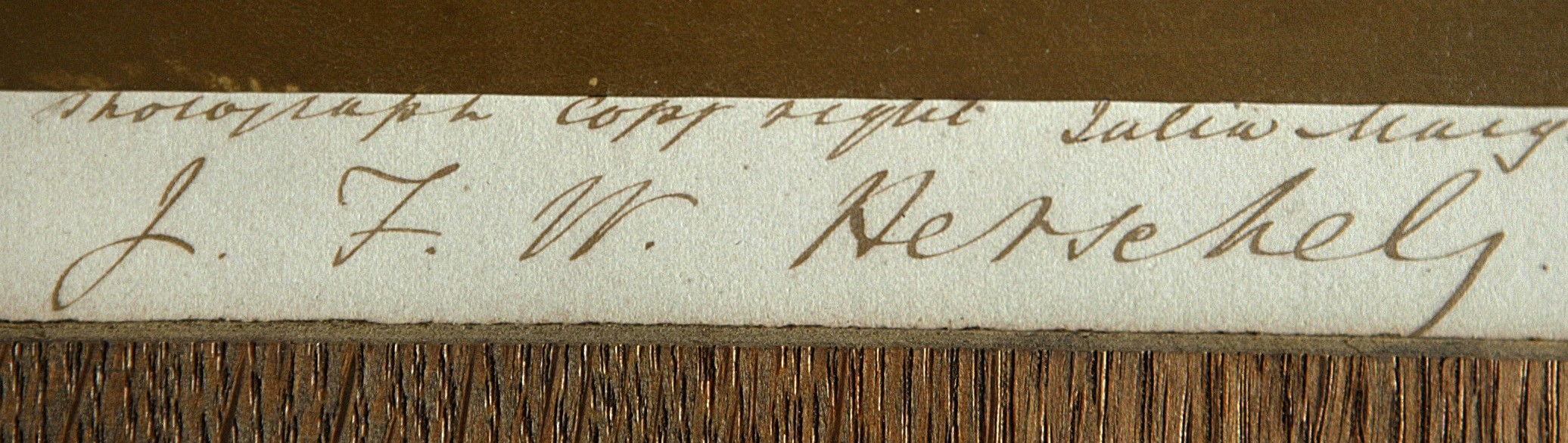
 The photographic mount ink inscription reads in full left to right: "From Life Registered photograph copyright Julia Margaret Cameron taken at his own residence Collingwood Hawkhurst Kent 1867" and then signed below: J. F. W. Herschel
Buried next to Sir Isaac Newton in Westminster Abbey, Herschel’s genius was an ability to make science understandable to both the curious and the more educated through his writings and presentations to the established scientific bodies of the mid 19th century.
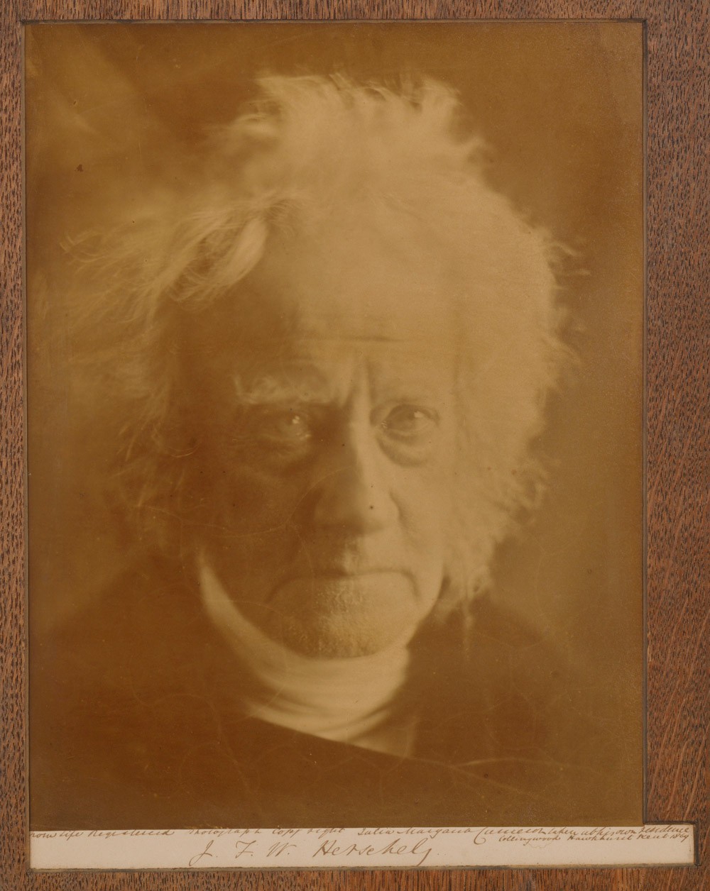
As a collector, I’ve always been drawn to the art of photography. However, I have an appreciation of the science that has always been the important backdrop for making modern photography possible in the first place, and Herschel’s role in that science. This wonderful photographic likeness of Herschel, taken by his dear friend Julia Margaret Cameron, has always been of interest to me as a collector because it combines both art and science.
A Cameron portrait of Herschel appeals on many photographic collecting levels. It is considered one of the great “head” portraits that Cameron was famous for-perhaps more so because of its brooding and mysterious nature; a symbolic likeness of a man whose life was spent on a quest for discovery and explanation of the unknown.
But It has never been my intention as a collector to purchase a photograph because it is considered one of the “greatest hits” in the history of the medium. On the contrary, I am continually surprised how much wonderful material is available of the unknown and unsung photographer, often for the price of a song. The beauty of collecting photography in our modern age is that its’ story has not been fully chronicled nor even discovered, and one of the aims of PhotoSeed will be to fill in some of these blanks for the record.
The four known portraits of Herschel were taken late in his life in 1867 by Cameron. Through much luck I was able to purchase this one, a mounted (with wood veneer overlay) albumen example at auction in 2004 from a gentleman who originally purchased it at auction in Dublin, Ireland in 2003.
Twice personally signed by Cameron, the bottom right hand corner of the mount provides the following inscription by her: “Given to Mr. Charles Hegan by Mrs. Cameron with her kindest regards.”
Naturally, I was intrigued as to the mysterious Mr. Hegan was and how he might have known Cameron. Through research, I tracked down the family who originally consigned the Herschel portrait as well as other items to the Irish auction. And this is why photographic sleuthing pays off. It turns out that in 1899 this photograph was a wedding present from Hegan to one Joseph Alfred Hardcastle. (born 1868) Never heard of him? It turns out he was Herschel’s grandson, and the photograph had stayed in Hardcastle’s family until 2003. A very nice provenance indeed.
A friend of a member of the present-day Hardcastle family in Ireland did research on my behalf, trying to figure out who Hegan was and his possible connection to Cameron, but came up empty. Later, my own research determined Hegan (Charles John Hegan) was a fellow of London’s Royal Geographical Society (elected 1873) who likely knew Hardcastle through scientific and perhaps family connections (they both attended Harrow but over 20 years apart). Ownership of the Herschel portrait makes complete sense as both Hegan and Hardcastle were devoted to scientific endeavors. On this front, Hegan travelled to South America to conduct fluvial research on behalf of the Royal Geographical Society and Hardcastle, a fellow of the Royal Astronomical Society who lectured and conducted research relating to astronomy, was appointed director of the Armagh Observatory in Northern Ireland, but died suddenly in 1917 while in route there.
So talk about the perfect wedding gift. Hardcastle’s love was astronomy. Although only three years old when his grandfather was buried next to Newton, Herschel would have been proud of a grandson following in his own esteemed footsteps.
 The photograph is signed boldly (believed to be in Cameron's hand) : J. F. W. Herschel
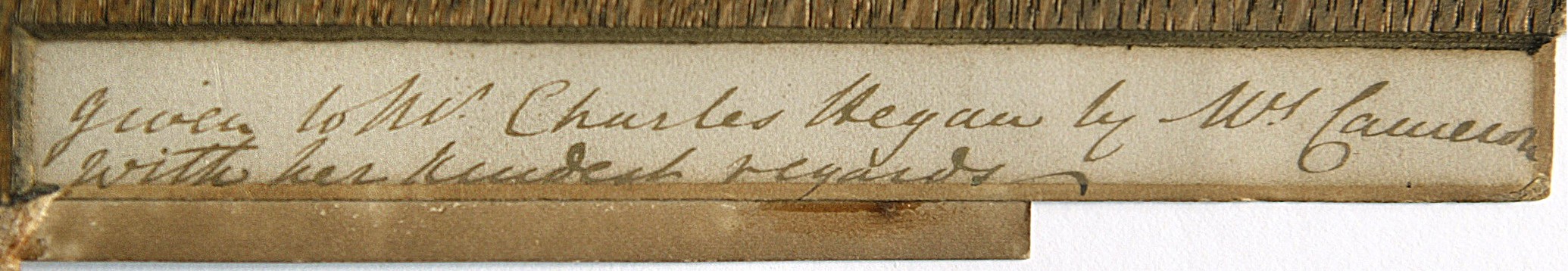 There are pencil notations by a framer most likely done after the 1899 wedding, including "Show all writing" on the back of the original Cameron mounting board. Visible as well and centered at foot of mount is a verso impression of a Colnaghi blindstamp, indicating the photograph was once marketed by Cameron through the well-known London gallery. Somehow, the print made its' way back to Cameron and she personally signed and presented it to Hegan at an unknown date: "given to Mr. Charles Hegan by Mrs. Cameron with her kindest regards."
Putting the Bits back into the Picturesque
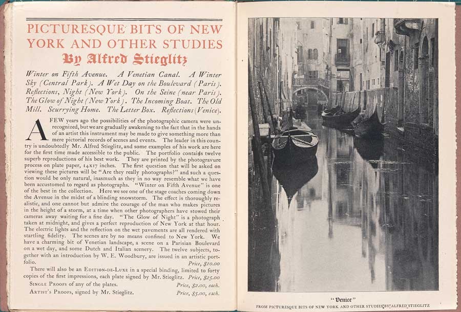
Posted March 2011 in Exhibitions, Significant Portfolios
When I found out last year the Metropolitan Museum of Art in New York City would be mounting a show on three of the greats: Alfred Stieglitz, Edward Steichen, and Paul Strand, I made a mental note that it would perhaps be the only time some of the greatest photographs of these masters would be assembled as a group for public view in my lifetime. Earlier this year, with daughter in tow from spring break, we made our way up the stairs to the Met’s 2nd floor photographic galleries. Before getting to the good stuff however, I made a beeline for the merchandise—conveniently placed right at the entrance. All I can say is that now I’m the proud owner of a Camera Work hat, apologizing only later to aforementioned daughter and her friend that good, old dad could not resist the idea of giving additional promotion to one of the greatest photographic journals ever printed. Never heard of Camera Work? Then be sure to pay a visit to PhotoSeed’s good friend Photogravure.com, where you can view every plate from the journal beginning here.
The nature of this post concerns something I saw under one of the display cases in the first gallery at the show devoted to the work of Alfred Stieglitz: the Metropolitan’s copy of Picturesque Bits of New York And Other Studies.
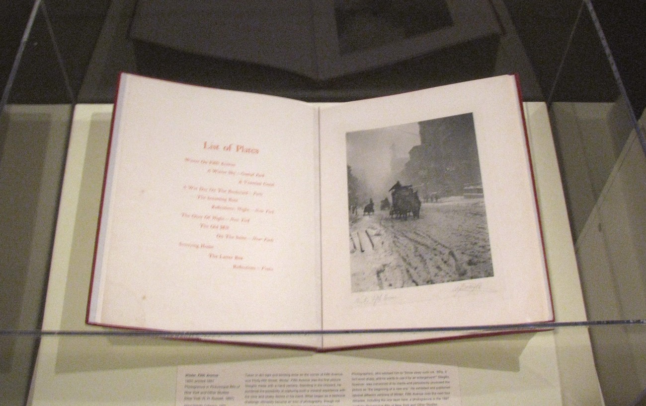 The Stieglitz gallery featured one of his most famous New York images: Winter, Fifth Avenue-the first plate presented with the portfolio.
What intrigued me the most was that it was opened to the first plate in the portfolio showing Stieglitz’s iconic image known as Winter, Fifth Avenue. What really got me excited was the fact it was printed on chine collé and additionally signed and titled by Stieglitz. Speaking of merchandising, over a century earlier he had teamed up with New York City publisher Robert Howard Russell to produce this portfolio. As an added bonus to the book-buying public, forty “Edition-De-Luxe” copies of the portfolio in a special binding, done from the first impressions with the plates signed by him, were offered at $25.00 each-a king’s ransom for the time. The Met’s copy is one of these special copies.
With just a bit of cursory research from my own library as well as online resources, I discovered that the first issue with this portfolio most likely had to do with Stieglitz promising more than he could pull off. An early promotional advertising poster for R.H. Russell’s involvement with the portfolio spelled out an apparently early incarnation of the title for the work: Picturesque New York. It prominently features the Winter, Fifth Avenue photograph printed as a photogravure. 1.
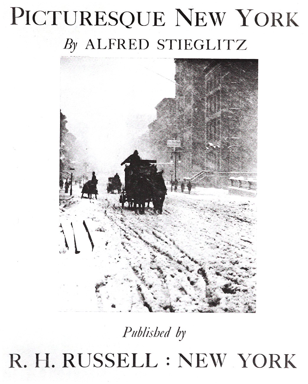 The original R.H. Russell letterpress for the poster is done in red ink.
“In the late 1890’s Stieglitz began a series of photographs of New York that would explore the city’s “myriad moods, lights, and phases”…2.
Had Stieglitz hoped he could assemble enough new material for this portfolio to show his true American roots before finally going to press? The quote highlighted above is believed to refer to work Stieglitz undertook after publication of Picturesque Bits but it is not inconceivable he wasn’t thinking about the New York project much earlier. After all, besides the four images appearing in this portfolio, his early New York work including The Terminal (1893), The Asphalt Paver (1892-3) as well as his general interest in photographing New York’s citizenry including the less fortunate (see Five Points, New York-1893) may have given him impetus enough to pull it off.
The concession finally made by Stieglitz to include some of his “greatest hits” taken from abroad still eliminated (for one copy writer of the time at least) the word “Bits” in the portfolio title. In a “Special Editions For Book Lovers” advertisement issued by R.H. Russell appearing in at least one source: (The Bibelot, 1897), the working title of the portfolio was Picturesque New York And Other Studies. 3.
Finally, a definitive source appeared including the elusive Bits: a booksellers catalogue issued by none other than R.H. Russell towards the end of 1897. In it, the following copy appeared opposite a full-page photograph of A Bit of Venice from the portfolio: 4.
“A few years ago the possibilities of the photographic camera were unrecognized, but we are gradually awakening to the fact that in the hands of an artist this instrument may be made to give something more than mere pictorial records of scenes and events. The leader in this country is undoubtedly Mr. Alfred Stieglitz, and some examples of his work are here for the first time made accessible to the public. The portfolio contains twelve superb reproductions of his best work. They are printed by the photogravure process on plate paper, 14x17 inches. The first question that will be asked on viewing these pictures will be “Are they really photographs?” and such a question would be only natural, inasmuch as they in no way resemble what we have been accustomed to regard as photographs. “Winter on Fifth Avenue” is one of the best in the
 Selling the Bits: R.H. Russell catalogue advertising the newly released portfolio: courtesy Photogravure.com
collection. Here we see one of the stage coaches coming down Fifth Avenue in the midst of a blinding snowstorm. The effect is thoroughly realistic, and one cannot but admire the courage of the man who makes pictures at the height of a storm, at a time when other photographers have stowed their cameras away waiting for a fine day. “The Glow of Night” is a photograph taken at midnight, and gives a perfect reproduction of New York at that hour. The electric lights and the reflection on the wet pavements are all rendered with startling fidelity. The scenes are by no means confined to New York. We have a charming bit of Venetian landscape, a scene on a Parisian Boulevard on a wet day, and some Dutch and Italian scenery. The twelve subjects, together with an introduction by W.E. Woodbury, are issued in an artistic portfolio.”
Notes:
1. Lot # 265: In: Photo-Secession | Catalogue 6 : Lunn Gallery-Graphics International Ltd: Washington DC : 1977: p. 124
2. See: Alfred Stieglitz | The Key Set: The Alfred Stieglitz Collection of Photographs: Volume Two 1923-1937: Sarah Greenough: National Gallery of Art, Washington| Harry N. Abrams, Inc. : 2002: p. 938
3. R.H. Russell advertisement: In: The Bibelot: A Reprint of Poetry and Prose for Book Lovers, chosen in part from scarce editions and sources not generally known: 1897: Volume III: Edited by Thomas B. Mosher: Portland, ME: p. 401
4. Books & Artistic Publications-Illustrated & Descriptive List of the Publications Of: R.H. Russell: 33 Rose Street, New York: 1897